Link to Project: https://contexualising-e2city.netlify.app
Our enquiry asked: How can electricity consumption at CSM be visualised across temporal scales? In dialogue with UAL’s Net Zero and Sustainability Implementation Plan (NZSIP), we focused on lighting as a measurable yet infrastructural form of consumption, where institutional decisions shape collective environmental impact.
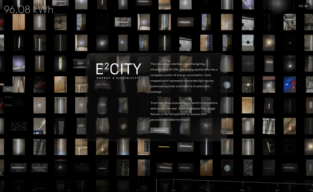
Following preliminary research and user testing, we conducted primary data collection across all four floors of the CSM building, documenting light fixtures through systematic photography and spatial mapping. We catalogued fixtures, researched bulb types, and estimated wattage through conversations with facilities staff, producing close approximations of overall consumption. While access restrictions limited exact measurements, the process revealed something unexpected: the overwhelming density of light sources. What appeared mundane became a vast system of diffuse energy expenditure.
Our challenge was not simply to visualise data, but to do so responsibly. We were conscious of two risks: drowning the viewer in excessive information, or flattening complexity through oversimplification. To navigate this tension, we used mapping, cataloguing, and grid structures combined with compression and expansion of scale. The interactive website allows users to zoom between macro and micro perspectives. Zooming out reveals cumulative institutional load; zooming in isolates a single fixture, displaying its location, wattage, and estimated consumption. A dynamic total usage counter and seasonal time scale layer temporal context without overwhelming the interface.
By structuring access rather than presenting everything at once, we treated visualisation as interpretation, positioning graphic design as a mediator between infrastructural systems, institutional accountability, and public understanding.
Draft 1
Accountability in Practice
Working on this project shifted my understanding of graphic design as a relational practice. Rather than treating energy consumption as neutral data to be visualised, I became aware of how design actively reconfigures the contexts it operates within, environmental, institutional, and social.
Engaging with UAL’s Net Zero and Sustainability Implementation Plan (NZSIP) initially felt abstract. Targets, percentages, and long-term ambitions existed at a scale that felt distant from everyday practice. However, conducting on-site documentation across the CSM building—photographing, mapping, and cataloguing hundreds of light fixtures—brought those ambitions into material focus. Climate responsibility became spatial and immediate. Each bulb represented a small, seemingly insignificant decision, yet collectively formed an infrastructural system of considerable environmental weight.
This process reshaped my position as a practitioner. I became more conscious that design does not simply reflect institutional strategies; it mediates how they are understood and felt. Constructing the interface required negotiating between accessibility and complexity, resisting both spectacle and oversimplification. I realised that visualisation is never neutral, it structures perception, distributes attention, and subtly frames accountability.
Working across scales, from a single fixture to cumulative institutional load, from daily rhythms to seasonal patterns, deepened my awareness of how climate justice operates through accumulation. For me, this project clarified that responsible graphic communication is not about producing definitive answers, but about making systems legible while acknowledging their limits. It reinforced my commitment to practice as situated, iterative, and critically attentive to the contexts it inevitably reshapes.
Draft 2
Annotated Bibliography: Six References Informing “From Bulb to Building”
2 texts from the reading list:
Steyerl, H. (2012) ‘In Defense of the Poor Image’, in The Wretched of the Screen. Berlin: Sternberg Press.
Steyerl’s notion of the “poor image” reshaped how we thought about visibility, circulation, and value within our project. Although our focus was electricity consumption rather than image compression, Steyerl’s argument that images gain political force through distribution rather than resolution helped us reconsider fidelity. Our lighting data was incomplete due to institutional restrictions and estimation limits. Instead of perceiving this as a weakness, Steyerl’s framing allowed us to see approximation as structurally embedded within systems of access and power. The project thus became less about producing a perfect dataset and more about exposing infrastructural conditions that shape what can be seen and measured. The website interface, which layers information progressively, mirrors the idea that visibility is constructed and mediated. Steyerl’s writing deepened our awareness that transparency is never total, and that representing institutional systems involves negotiating gaps, compressions, and constraints.
Reinfurt, D. (2019) I-N-T-E-R-F-A-C-E: A New Program for Graphic Design. Los Angeles: Inventory Press.
Reinfurt’s conception of interface as an active structure rather than a neutral surface strongly influenced our approach to the website. He frames graphic design as programmatic—organising how information is accessed and sequenced. This resonated with our need to mediate between micro and macro scales of energy consumption. Instead of presenting all lighting data simultaneously, we structured access through zoom functionality and temporal sliders, allowing scale to become navigable rather than fixed. Reinfurt’s pedagogical emphasis on systems thinking reinforced our grid-based mapping strategy and iterative testing process. His work helped position the interface itself as a site of contextualisation: the way information is arranged shapes how responsibility and accountability are perceived. This shifted our understanding of design from representational to relational—where interaction produces meaning.
2 texts outside the reading list:
Garland, K. (1964; updated 2000) ‘First Things First’, discussed in AIGA Eye on Design (2019) ‘Why Ken Garland’s First Things First Manifesto Keeps Getting Updated’. Available at:https://eyeondesign.aiga.org/why-ken-garlands-first-things-first-manifesto-keeps-getting-updated/
Garland’s manifesto, and its continued revision, foregrounds design’s ethical responsibility within social and environmental contexts. Engaging with this text positioned our project within a lineage of designers questioning where attention and labour should be directed. By focusing on institutional energy infrastructure rather than aesthetic spectacle, our project aligns with the manifesto’s call to prioritise socially consequential communication. The updated discussions around sustainability and climate justice reframed our enquiry as more than a formal exploration of scale; it became a reflection on how graphic communication can redirect institutional focus toward environmental accountability. Garland’s insistence that design is never neutral strengthened our awareness that visualising energy data is itself a political act—shaping what is prioritised, questioned, or ignored.
Latour, B. (2004) ‘Why Has Critique Run out of Steam? From Matters of Fact to Matters of Concern’, Critical Inquiry, 30(2), pp. 225–248.
Latour’s distinction between “matters of fact” and “matters of concern” informed how we approached energy data. Rather than presenting electricity consumption as detached numerical fact, we aimed to frame it as a shared concern embedded within institutional systems. Latour’s argument that critique should assemble rather than merely debunk resonated with our method of mapping and layering rather than exposing failure. The project does not accuse; instead, it situates viewers within a network of infrastructural relations. By allowing users to navigate between individual fixtures and cumulative load, the interface assembles connections between small-scale actions and systemic impact. Latour’s framework strengthened our understanding of contextualisation as relational: energy consumption becomes meaningful not in isolation, but within networks of policy, architecture, and daily use.
2 design practices/projects:
Worth, J. (2015) If the Moon Were Only 1 Pixel. Available at:https://joshworth.com/dev/pixelspace/pixelspace_solarsystem.html
Worth’s project provided a crucial precedent for working with extreme shifts in scale. By translating astronomical distances into scrollable digital space, he makes incomprehensible magnitude experientially navigable. This approach directly informed our zoom-based interface, where users transition from individual light fixtures to institutional accumulation. Worth’s work demonstrates how digital interaction can convert abstract data into embodied spatial experience. Rather than compressing scale into a static infographic, he expands it temporally and spatially, allowing users to feel distance through duration. This strategy influenced our decision to incorporate temporal sliders and cumulative counters, reinforcing the experiential dimension of energy consumption. Worth’s project showed that scale can be designed as an interface condition, not merely represented visually.
Eliasson, O. (2023) Uncertain. Available at:https://olafureliasson.net/uncertain
Eliasson’s practice foregrounds perception, uncertainty, and environmental awareness through spatial installation. Uncertain informed our sensitivity to how viewers encounter systems rather than simply observe them. Eliasson often makes invisible forces—light, atmosphere, climate—materially perceptible without reducing their complexity. This resonated with our attempt to visualise infrastructural lighting systems without flattening nuance. His work emphasises relational experience: meaning emerges through interaction between body, space, and environment. While our medium was digital rather than architectural, the principle remains similar. By structuring zoom and temporal navigation, we aimed to produce awareness through movement rather than didactic explanation. Eliasson’s approach reinforced our understanding that climate-oriented design should cultivate attentiveness rather than overwhelm, balancing clarity with openness.
Leave a Reply